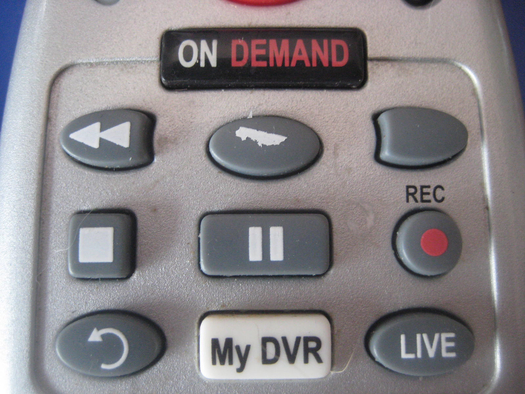
The great thing about physical objects is wear and tear. The places you touch most wear down, an ideal indicator for the key functions in your remote interface. This type of observation has even led to abstract art such as the traces left by different iPad apps. You can tell a lot about how something is used by investigating these physical traces. Doing the research to collect that data can be fun, using heat maps, click tracking or even a screen cover and paint. The results of that research can be visually persuasive too. It’s pretty obvious from the photo on the left that play and fast-forward are the main used buttons. ON DEMAND is bigger, screaming at you to spend money on content… why isn’t the really useful button (play) in that simple central place? Did the big “on demand” button increase rentals?
“Pick up any modern TV remote and you’ll immediately see the problem of experience rot. On/Off, volume and channel selectors are no longer enough. We need to switch devices, control captions, have a text capability for on-screen editing, a thumbs-up and thumbs-down for ratings, pause, record, slow motion, rewind, 30-second rewind” [from Jared M. Spool’s Experience Rot]
All too often, interfaces do not have enough affordance in their design for what we really need to use. The best web applications use progressive disclosure. Google UX principles (no longer on their corporate site) stated their applications would “provide a natural growth path for those who are interested”. With a remote control unit, it’s a bit difficult to allow an interface to evolve. It does however make great sense to provide most used buttons (analogous to website features) in the best place, ergonomically easy to reach when holding the unit comfortably in your hand. Many remote control units get this wrong. Websites too.
With the increasing ubiquity of mobile phones (and multi-touch screen technology in general), interface affordance can become interactive. Why not hide away all the crap you don’t need more than once or twice a year, and leave just the most used controls? Freemote, an Android app for French Freebox ADSL triple-play boxes, does just that.

In an increasingly touch and gesture based world, we could swipe, slide and select to move onto a screen that includes extra options we need occasionally, just like the freemote app allows you to do. Intelligent remote control units can improve our lives by making the most used features quick and easy to find. Nest have developed a learning thermostat which can even save you money. Any interface can save you time, if the design strategy keeps focus on keeping it simple.
Where it all goes wrong is when, because it’s “the web”, you keep iterating on new releases and keep adding features to interfaces ad infinitum. Sooner or later there may be a push to do a big new feature release or a rebranding / graphical redesign. How often is there a big push to prune core features or simplify the incumbent interface?
Designers and developers alike dream of rebuilding from the ground up. Sadly, that’s what nascent competitors do. Within an organisation the best you can do is state the principles you wish to work to, and then live them. Every day. Fight for simplicity, restructure the interface at every opportunity, and make sure that when you benchmark the best examples you see every day, you show the examples to as many people as you can.
Mobile design for small screens is a great way to imagine a useful set of things to click (buttons, form elements, product options) that form a coherent screen. Use the mobile revolution to improve the way your website works too. Indeed mobile is becoming semantically redundant because often people are on “mobile” devices but are sitting in their bedroom, watching TV, and texting friends.
“A huge chunk of our users don’t even have a personal computer in the first place, so why are we removing content and functionality to which they’ll then never have access?” [From SuAnne Hall’s, Three Reasons We’ve Outgrown Mobile Context]
So why not take a look at your website click stats / heat maps. Look where your wear and tear is happening. Maybe you could get rid of some of the distractions, improving the usability of your website or application, which will make it friendlier. The better you do this, the easier it might then be to transition from a PC/screen/keyboard/mouse paradigm to a universal application for your readers or customers. Everybody can gain from keeping the lesser used stuff out of the way. They’ll look for it if they need it. If they’re not aware it’s there, there are plenty of tools – including marketing, in-app tutorials, gamification – that can help feature discovery. Seldom used features shouldn’t be pushed too hard for the sake of it either. Users that engage enough with your brand or product will spend time, occasionally, checking out option screens or creating / enriching their account to make their on site / in app experience more fluid. They won’t waste time discovering all your glorious complexity if their initial experience isn’t almost instantly useful or pleasurable.
I believe we are entering into a new age of minimalism driven by the requirement to reduce noise as much as possible, because the digital noise the new generation are wading through means your signal is going to be harder to detect. Matt Gemmell, writing about simplifying blogging, said
“I bet you could simplify
your blogin some way without detracting from thereadingexperience.”
I have simplified that further. You could even say that simplification, rather than detracting from the original experience, actually improves it.
10/6/2013 at 10:24 am
Hey Simon,
Nice post. I agree, we definitely need to move towards interface simplification, especially in those times where mobile devices are taking more and more place in our lives.
It’s no surprise we see a big trend of “flat” design mixed with minimalism on a lot of interfaces, since they are a perfect way of simplifying things (even though flat design is more about aesthetics).
On a side note, I’ve redesigned my personal blog a few months ago and I’ve followed the same global principles as Matt Gemmell. Simplicity is definitely the key to writing blogs.
10/6/2013 at 11:39 am
Hi Ronan,
I’m not sure flat design and minimalism are linked, though flat design is aesthetically simpler. I’ve seen some very busy flat design too.
I’m thinking about how to simplify this blog further after reading Matt Gemmell’s post. When I get around to it I will…
Is your blog’s WordPress template based on a freely available template base? I like the hidden sidebar/menu system a lot.
-Simon
10/6/2013 at 1:30 pm
Agreed, they are not always linked but I often see them used together – at least on a lot of designers blogs 🙂
As for my blog, it’s built with WP but the theme is my own. I’ve adapted my sidebar from a plugin called Sidr: http://www.berriart.com/sidr/. Best plugin I’ve used for this kind of slider.
7/10/2014 at 12:24 pm
You started with a TV remote & Moved on to Digital Marketing. Nice Comparisons & really a great piece of writing.